
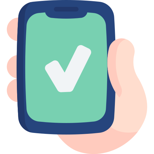
problem statement
Health-conscious people need a means of storing and tracking their health information in one web portal, rather than having to switch between apps for different aspects of health. Additionally, they want to be motivated and educated to build up a healthy lifestyle based on their needs.
design process
The User-Centered Design approach was implemented throughout the process. It started with user research to identify problems, and then used iterative design to continuously improve the product by usablility testing, design critique sessions, and alignment with style guide.

01. research
User Interview
The first and most critical step is to learn about my users: what they think, feel and need when it comes to personal health management. I interviewed four people who pay close attention to their health, with different ages ranging from 20-50 years old and different genders.
Insights
-
 People use different apps to track different data, such as diet, exercise, and period
-
 How well the information is organized and presented is important to users
-
 Seeing goals achieved step by step motivates people
-
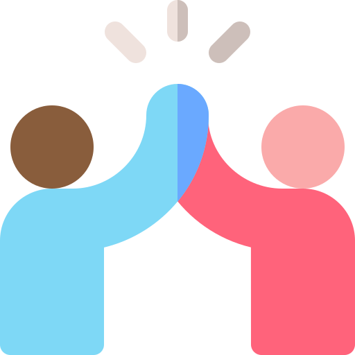 Being able to share progress with friend motivates people
I wish I could be as fit and energetic as I was back in college! I used to love training with my buddies on the swim team.
Philip, 23 years old
Competitive Analysis
I researched the market and sorted out two catogories of health management apps: comprehensive and specialized.

Comprehensive Service
Ambitiously aim to offer an all-in-one package to serve as many people as possible. The features of these apps are usually complicated and overwhelming.
Specialized Service
Focus on single aspect of health, such as exercise, or diet. These apps are very easy to get started with. But users have to switch between products if they have multiple concerns.
Business opportunities
A web portal that covers most common health concerns rather than single wellness aspect. It shall be simple, straightforward and easy to customize.
02. define
Persona
I crafted several personas based on my user research. By identifying their goals, needs, and frustrations, I was able to establish a set of key features that I would focus on.

User Journey Map
After creating personas, I mapped out user journeys to focus not only on who my personas represent, but also on the thoughts and emotions they exhibit throughout their journey as they work to achieve their goals with the app.

User Flow
By creating user flows, I walked through the process of completing certain task from persona’s point of view, so every need could be satisfied at every point of the user flow. I also determined which screens were needed for the next step.

03. ideate
Card Sorting
The goal of card sorting was to validate my sitemap. Seven people participated in the open card sorting and they were asked to sort 19 cards into a few categories and to name each category.

Takeaways
- Some functions could be consolidated and regrouped to navigate more intuitive and to avoid dashboard clutter.
- A few sub-categories may be accessed by more than one path.
- Some labels of the category are not very straightforward to users and are better to be re-worded.
Information Architecture

Paper prototyping


low-fidelity wireframes

abc
04. test
Usability testing
Methodology
The usability tests were moderated, either remotely or in-person. The sessions were video recorded.
Participants
The study tested six participants who were recruited through personal network. They were screened for basic demographic information to ensure they fit with user personas of Olive.
Goal
The goal for this study was to evaluate the learnability for new users interacting with the app Olive for the first time on mobile. I would like to observe and measure if users understand what the app can do for them, and how to complete basic initial functions.
Metrics
Errors will be measured using Jakob Nielson’s scale:
- 0 = I don't agree that this is a usability problem at all
- 1 = Cosmetic problem only: need not be fixed unless extra time is available on project
- 2 = Minor usability problem: fixing this should be given low priority
- 3 = Major usability problem: important to fix and should be given high priority
- 4 = Usability catastrophe: imperative to fix before product can be released
script
test results
affinity map

Major Error Fixing
I assessed the severity of errors and fixed major ones.
Issue 1: The share tab icon was ambiguous.
[severity: high]
Evidence: 33% of the participants cannot find the access to share exercise data with friends. They either failed the task, or spent much time figuring out how to complete it.
Design Decision: Change the icon to a more understandable one and add text “share” underneath the icon to give more hint
before
after

Issue 2: The response of selection was not obvious.
[severity: high]
Evidence: 67% of the participants did not notice any response after they selected certain data.
Design Decision: Make the response more obvious, such as highlighting the whole line, or giving a confirmation button instead of forcing users to go back.
before
after

A/B Testing
Testing Goal
I tested 10 participants on the Helio platform to assess which design was clearer and more encouraging for onboarding selection of data to help new users build their initial dashboard.
variation a
variation b


Testing results
70% of the participants chose Variation A and only 30% chose Variation B. The main reason was that Variation A with white background looks cleaner and simpler to most participants.
05. iterate
Peer Review
During the design iteration process, I invited six other designers to review my prototype. This enabled me to identify mistakes and shortcomings, as well as make improvements to visual elements and address any functional omissions.
before
after


- Differentiate colors of blood pressure data
- Add copy to “sort” icon
- Make navigation tab copy bolder
before
after


- Make “add to favorite” more obvious
- Increase the spacing of components
- Increase the font size of article
Style Guide
Colors
Olive green as theme color: to evoke feelings of nature, growth, and prosperity, and to emphasize the brand identity.
primary color
-
primary background
-
primary CTA background and button text
secondary Color
-
secondary button background
-
data chart accent color
-
card background color
-
information text
Typography
| Aa | Sail, regular (logo and welcome) |
|---|---|
| Aa | Open Sans, bold (headlines) |
| Aa | Open Sans, regular (information text) |
Icons

UI elements
buttons

|
Use “Button Text - Large CTA” for text. Button height 40; Width expands to screen margin; Centered; |
|---|---|

|
Use “Button Text - Medium CTA” for text. Button height 40; Width varies; Centered; |

|
Use “Button Text 1”: #333333, Regular, Align with icon, padding 8 between text and icon |

|
Use “Button Text 1”: #5B8B43, SemiBold, Align with right |

|
Segmented button: use color shade and SemiBold font to display selected tab |
text fields

|
Basic text field: use neutral grey |
|---|---|

|
Active text field: use primary green |

|
Error text field: use red |

|
Search text field: use search icon |
Accessibility
The app is designed to meet the standards of WCAG AA and ensure important visual elements have a contrast ratio of at least 4.5:1. Additionally, color should not be used as the only means to provide information. Additionally, I added a tool to customize font size at the user's convenience.

06. Mockup


onboarding
data record and goal setting
data sharing and education
abc
future steps

|
Interview with people with underlying health conditions to explore their special needs |
|---|---|

|
Study technical and design solutions to connect typical devices that monitor health data |

|
Test out the idea to receive report and instructions from doctors |
|
|
Test which chart presentation is the easiest to understand and follow |
reflection
The most challenging aspect of this project for me was the fact that health management is a highly professional and personal area. It is not easy to design a product that would satisfy the various needs of users. Initially, I had a long list of features that I wanted to include in the app. I struggled with prioritizing them and determining whether they would actually solve users' real problems.
User research provided valuable insights and even surprised me with some of the results, such as users' attitudes towards sharing data and how they preferred to do so. It served as a cornerstone throughout the entire design process. It ensured that every insight I gained from the research was reflected in the design and that user problems were adequately addressed.