
Background
As a regular user of the Quizlet flashcard learning app, I have found it to be extremely helpful in making use of fragmented time to build my vocabulary or learn new subjects.
I noticed that Quizlet is widely used in schools by teachers and students as a study tool. Many elementary and middle school students use Quizlet on either a desktop or tablet. However, I began to wonder how easy it is for educators and students to utilize the app, and whether it could be redesigned to better fit their needs. With these questions in mind, I embarked on a journey to redesign Quizlet.
Problem statement
Students need a flashcard tool to use on desktop, laptop or tablet that they can not only study on any subject, but also review their progress, customize their study contents easily and get motivated to stay on track.

Research
To gain a better understanding of my target users and their expectations and pain points when it comes to studying tools, I conducted user interviews with three students: one from 5th grade, one from 7th grade, and one from 11th grade. Here are some key findings from my research:
Simpler interface, less distraction
Students prefer tools with a simple interface to minimize distractions.
Visual aids
Visual aids such as images and diagrams are helpful for students when it comes to memorization.

Study teacher’s content VS. create my own
Elementary and middle school students typically use flashcards provided by their teachers to prepare for quizzes and tests, while high school students tend to create their own flashcards.

Competition or rewards
Competition with fellow classmates can be a motivating factor for students, and younger children appreciate being rewarded by the tools they use.

I was observing one of the interviewees studying with Quizlet.
I like typing terms and definitions in my own set. I start memorizing them when I type or write them down.
Gloria, 12 years old
The research results led to a few questions:
How might I...
- Optimize learning experience on big screens, e.g. desktop, laptop and tablet
- Help students create their own study set easily
- Build up a rewarding system or friendly competitive environment to motivate students
Redesign

Mockup of the redesign
Experience #1: Home page

Assessment of Quizlet current home page
Problem #1: Inefficient navigation to a study set - “4-clicks away”
One of major user flows is to find a certain study set to start study. This is what homepage navigation needs to provide. However, in the current flow, if “study set A” is not recently used, the app requires “4-clicks” (or “4-taps” for iPad users) to access it.

Current user flow to access study set
Revised user flow to access study set
On the homepage layout, users only see recent files. If the file is not most recently used, It takes a few steps to find the file starting from the hamburger menu.

Current home page layout

Revised home page layout
Problem #2: Ambiguous and flimsy reward system
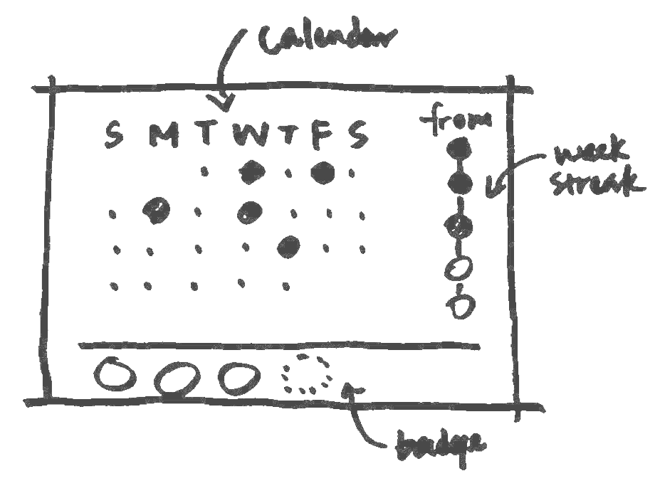
Quizlet adopts two reward systems: streak and badge. If both of them work properly, they encourage users to use the app regularly and achieve certain goals.
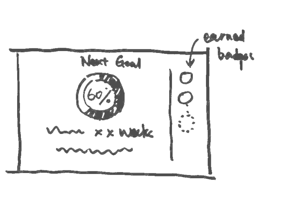
However, the dashboard of reward system called “Achievements” is not prominently displayed, requiring users to scroll down to access it. Additionally, the visual presentation of the existing streak reward system could be improved to more clearly show a user's progress towards the next milestone, as it is currently difficult to discern where users stand and how far they still need to go.

Current “Achievements” dashboard of home page
I brainstormed several design options to explore how streak and badge systems could work together to provide users with clear goals and progress feedback.
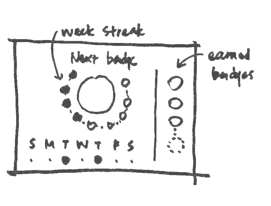
Design options of reward display
Ultimately, I decided to display both weekly streaks and earned badges in the dashboard. An animation showing the weeks that the user has completed provides a sense of accomplishment and indicates how close they are to the next milestone - in this case, a new badge.
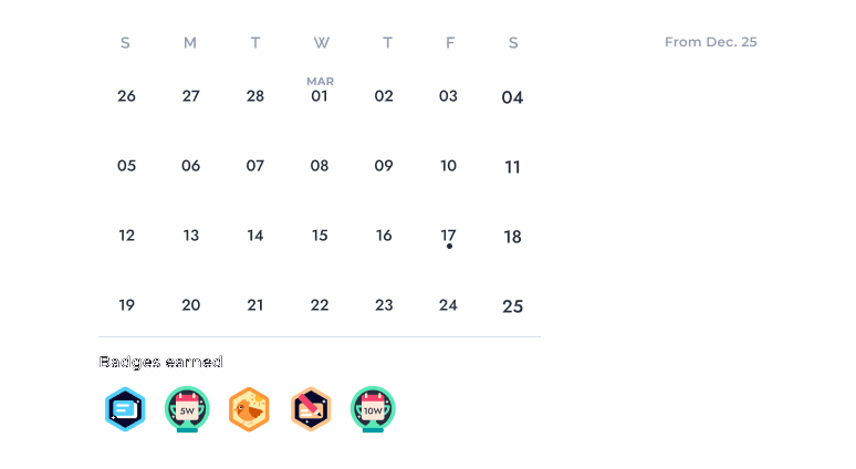
Revised "Achievements" dashboard of home page
The “Achievements” dashboard serves as an overview of what the user has achieved and what they are striving to achieve. Displaying the progress of each study set helps users understand where they stand in terms of a specific set. To accomplish this, I incorporated progress tracking into the card of each study set on the home page.

Current study set card design

Revised study set card design
Redesign of the home page

Experience #2: Study mode
Problem #1: Default flashcard mode dominates the page
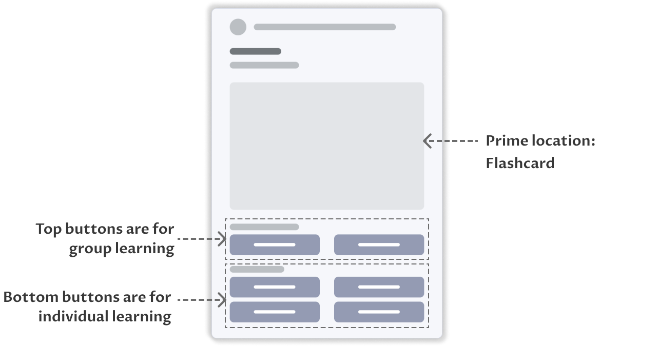
Current study set layout diagram
Based on my research, one of the features that students like about Quizlet is its various study modes, which include not only flashcards but also multiple-choice, tests, and games. When users access a study set, they expect to be able to choose their preferred study mode. Therefore, the study mode options should be prominently displayed, rather than a default study mode, such as the flashcard mode in the current design.
While students may occasionally use Quizlet for group learning during class, they are more commonly using it for individual studying at home. Therefore, the individual learning function is used more frequently and should be given priority over group learning. It would make more sense to place the individual learning feature at the top.
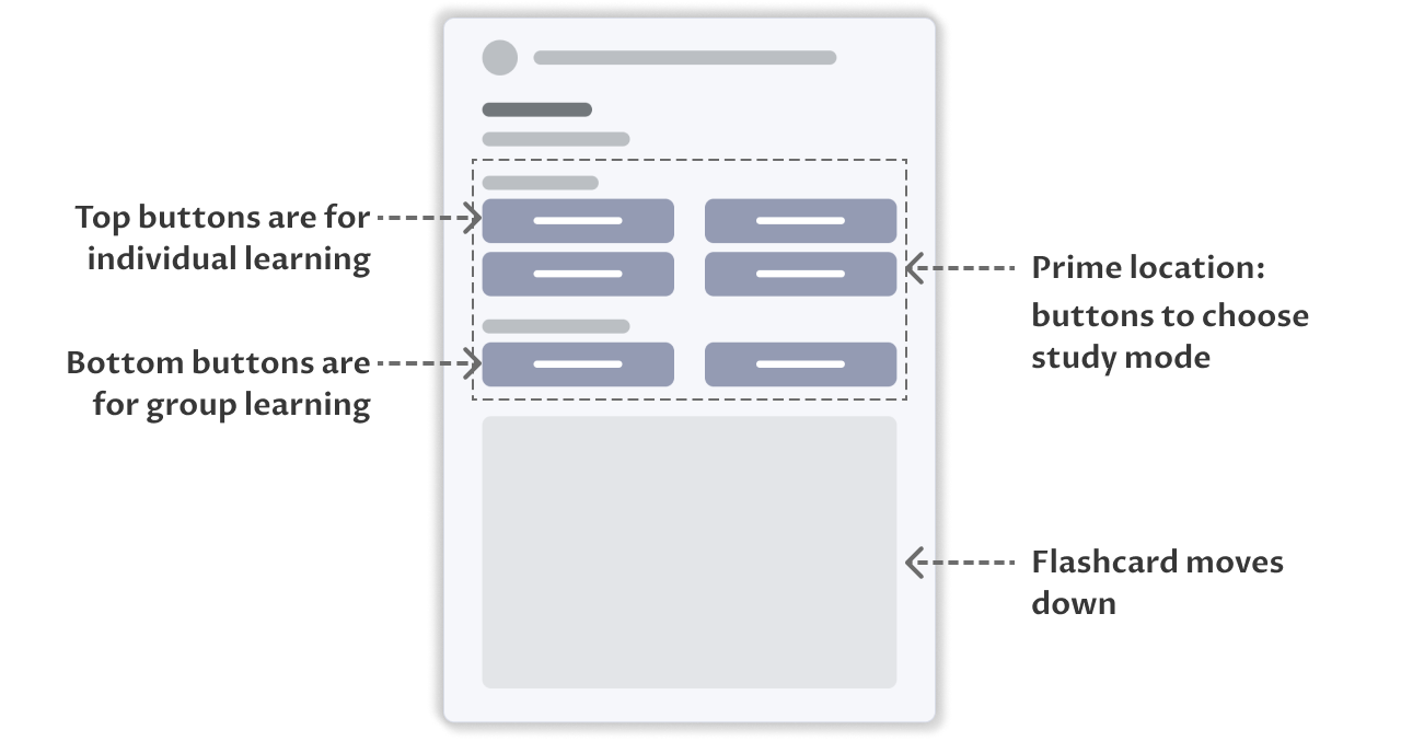
Revised study set layout diagram
Problem #2: Inconsistent and confusing UI elements

Current design of study mode
Redesign of study mode

Experience #3: Create / Edit cards
Problem #1: Too many buttons of editing, less efficient to find the needed one
On the study set page, there are many buttons of editing competing for attention. I consolidated them and hide the options that are occasionally used in “more actions” to make the interface clearer and easy to navigate.

Current sitemap of editting
Revised sitemap of editting
Problem #2: Accessibility and visibility of core features
Most core features are displayed as circular buttons with icons only. Desktop users can see hover text that explains the functionality, but tablet users may find it difficult to access this information.


Current flashcard edit mode
Redesign of create / edit mode
Prototyping of creating a study set

Screen of create / edit cards
Reflection
The project involved redesigning my favourite education app to improve its usability and user experience. One of the main challenges I faced was balancing the need for simplicity with the need for comprehensive features. I wanted to create an app that helped students concentrate, but also provided them with all the functionality. To tackle this challenge, I referred to my user research, including user interviews and usability testing. Through this research, I identified several pain points and user needs that I would address in the new app design.
The redesign focused on simplifying the navigation and user interface, as well as improving the visual design of the app. I also improved some key features, such as adding visual aids and highlighting reward system.
This project taught me the importance of conducting user research and testing, as well as the importance of balancing simplicity with functionality. It was also a great opportunity to hone my UX design skills and learn from the feedback of fellow designers.